![]()
![]()
![]()
![]()
![]()
![]()

Are you ready to transform the way you see and use data? Tableau is more than just a data visualisation tool, it’s your gateway to interactive, intuitive, and impactful business intelligence.
With Tableau, you can:
✅ Connect to multiple data sources (spreadsheets, databases, cloud services)
✅ Visualise data through simple charts or complex dashboards
✅ Make smarter, faster decisions with real-time data analysis
✅ Collaborate effortlessly across teams
Thanks to its drag-and-drop interface, you don’t need to be a data expert. Whether you’re a beginner or advanced user, you can analyze and share insights like a pro.
To create clean, responsive dashboards in Tableau, you’ll need to understand containers, a vital layout tool you can’t afford to ignore.
There are two types of containers:
Arrange elements side by side, from left to right, making them ideal for placing multiple visualisations, filters, or other objects in a row.
They ensure consistent alignment, ease of adjustment, and responsive design, as elements within a horizontal container adjust their width dynamically to fit different screen sizes.
✅ Best for:
→ Displaying multiple charts in one row
→ Keeping visual elements aligned
→ Ensuring responsiveness across screen sizes
For example, place a bar chart for monthly sales next to a line chart showing trends, all within the same row.
These stack elements top to bottom, perfect for adding structure and flow.
They are perfect for creating a column of visualisations, filters, or other objects. Vertical containers maintain consistent vertical spacing between elements, facilitate the movement and resizing of grouped elements, and ensure a better user experience across devices by adjusting the height of elements dynamically.
✅ Best for:
→ Creating vertical columns of filters or charts
→ Keeping spacing consistent
→ Improving mobile responsiveness
You can use a vertical container to stack filters and legends on the side of your dashboard, helping users interact with your data easily and intuitively.
How to create Tableau
Step 1: Open Tableau and Create a Dashboard
→ Launch Tableau and open your workbook.
→ Navigate to the “Dashboard” tab and click “New Dashboard” to create a new dashboard.
Step 2: Add a Container to the Dashboard
→ In the dashboard pane on the left, you will see a section labelled “Objects.”
→ Drag a “Horizontal” or “Vertical” container from the “Objects” section onto your dashboard workspace.
Step 3: Add Elements to the Container
→ Once the container is placed on the dashboard, you can start adding elements to it.
→ Drag and drop visualisations, filters, text boxes, or other objects into the container.
→ For a horizontal container, elements will be placed side by side. For a vertical container, elements will be stacked on top of each other.
Step 4: Adjust the Size and Position of Elements
→ Click on the edges of the container or the elements within it to resize them.
→ You can also drag elements within the container to reposition them as needed.
Step 5: Customise the Container
→ Click on the container to select it. You will see a grey border around it.
→ Use the options in the toolbar (on the left) to adjust the padding, borders, and background colour of the container.
→ You can also add titles or captions to the container if needed.
Overall, containers streamline the design process, improve the functionality of dashboards, and contribute to a more professional and user-friendly presentation of data.
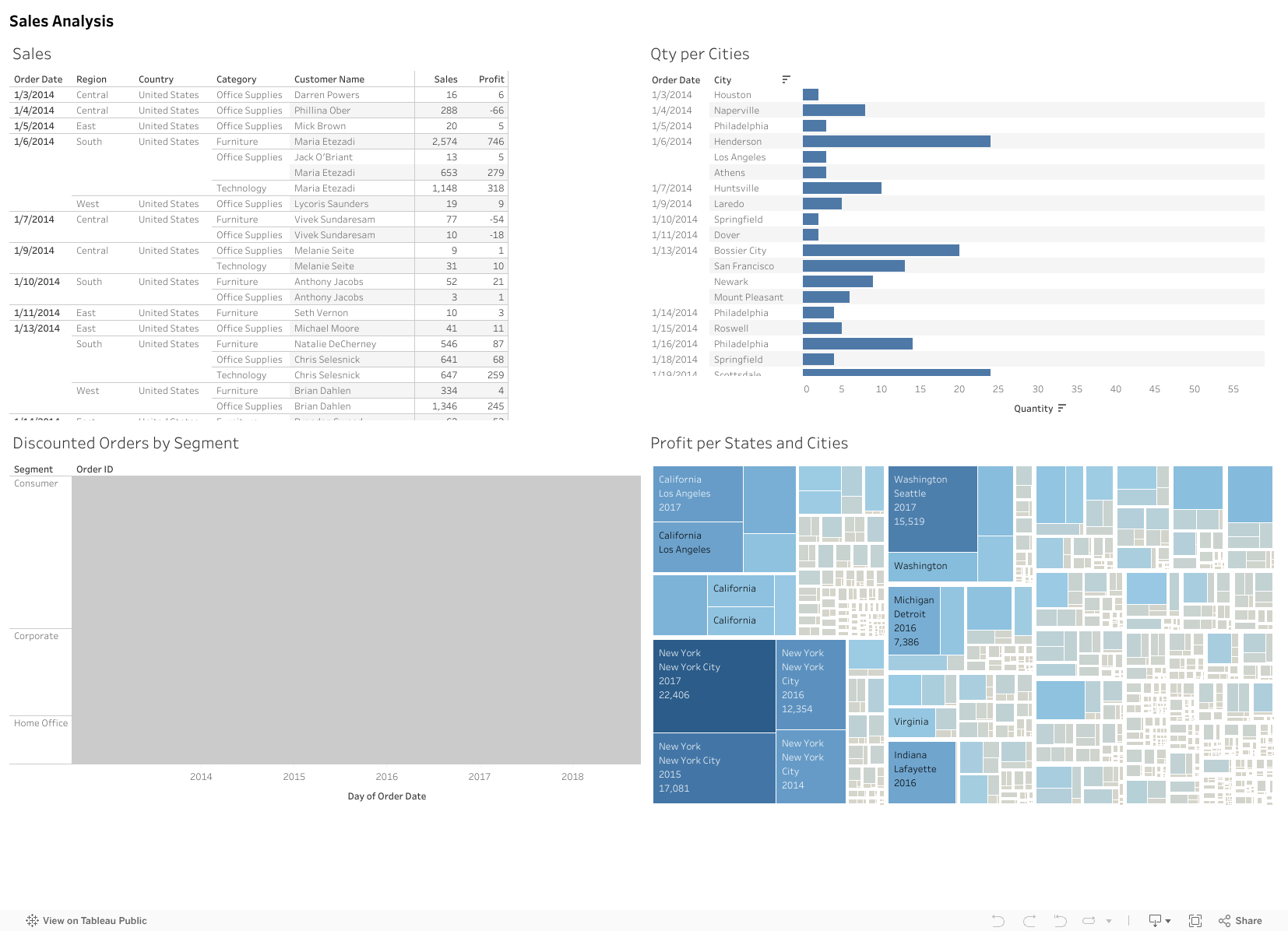
Here, you can view the result in Tableau Public:
Watch the video tutorial here:
About btProvider:
We hold all possible technical and sales certifications for all products:
Tableau Desktop, Tableau Public, Tableau Server, Tableau Prep, and Tableau Data Management.
With Tableau Software – the best data visualization platform – you can always understand your business or your job better. Using Tableau, you will make intelligent and strategic decisions and quickly understand the data flow, numbers, and the results it produces. See other #skillpill video tutorials here:
How to display multiple insights on a dashboard in #Tableau
How to create Stacked Bars on Grand Totals in Tableau
How to create a Buffer Zoom in a Tableau Map
Are you interested in learning more about Tableau Software – one of the best analytics tools and implementing the solution in the entire company?
See how Tableau works, by downloading a free trial here:

How to Retrieve and Process JSON Data from a REST API in Talend Are you working as a Data Engineer, and have you started using Talend? Maybe in one of your projects, you need to retrieve data from a REST […]

You are working at a Data Analytics company, and in one of your projects, you need to load data from a source into a target table using Talend. However, while running the Talend Job, the data will fail to load […]

In this Skillpill, you will learn how to use tSendMail in Talend. tSendMail is a component used to send emails directly from a Talend job. It supports various email protocols, such as SMTP, and allows the configuration of the sender, […]