![]()
![]()
![]()
![]()
![]()
![]()
Large companies deals with a large volumes of information, coming from multiple data sources and data sets. To be able to visualize all data, the user should have at his disposal powerful analytical tools which provides the benefit of creating interactive and easy to understand charts, dashboards or other types of analysis. When dealing with a large amount of data, extracting the information needed, as well as displaying it can be a challenge for most users.
Tableau Software is one of the most appreciated data analysis tool provider in the world. The large variety of different types of analysis made available to users comes also with a visual appeal hard to ignore, which gets the attention through different shapes or colors. In the last years, with each launch of new features, Tableau Software makes the transition from classic diagrams to dynamic and captivating analyzes.
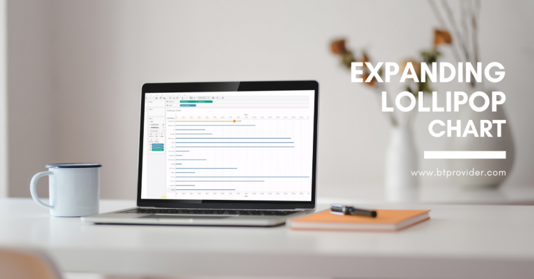
An Expanding Lollipop chart in Tableau, business intelligence software, is an alternative to the classic bar chart or line chart diagrams. Lollipop chart is preferable when we want to analyze data with large and close values.
As the name suggests, Lollipop chart is represented as lines and bullets. Bullets are located at the end of the line and have the role of highlighting the value of the data arranged by categories. The user has the possibility to set the size of lines and bullets so that it is as easy as possible to analyze the data values. Also, the bullets can be replaced with different images representing the analyzed categories.
An Expanding Lollipop chart helps end users to visualize a specific category inside an hierarchy, so they can hover over the categories and select and highlight the category that they want to analyze. Lollipop analysis type is used when we want an interactive way of visualizing the values of certain categories.
Below you can find a step by step guide which shows you how to create an “Expanding Lollipop Chart”, followed by a video demonstration.
In Tableau Desktop, connect to Superstore sample data provided by Tableau Software.
→ Drag the Sales on Culomns twice.
→ Right click on the second axis and select Dual axis, and then repeat this step but now select Synchronize axis.
→ Drag the Subcategory on Rows.
→ Change the visualization from the Mark area for the first field into bar and for the other into Circle. Also, from here we can modify the Size.
→ Create a new parameter named Subcategory Parameter and choose from the Data type -> String and from the Allowable values -> List. Now, go to the Add values from tab and select the Subcategory field. Then choose OK.
→ Create a new calculated field named Subcategory Size & Color with the formula:
IF [Sub-Category Parameter] = [Sub-Category] THEN 5
ELSE 1
END
→ After this calculated field will be created, right click on it and select Convert to discrete and drag it on the Dimension area.
→ Create another calculated field named Subcategory Label with the formula:
SUM(IF [Sub-Category Parameter] = [Sub-Category] THEN [Sales]
ELSE NULL
END)
→ Go to the marks area and drag into the bar visualization the field Subcategory Size & Color on Color. Drag into the circle visualization the Subcategory Size & Color on color, the Subcategory Size & Color on Size and drag the Subcategory Label on label.
→ Create a new Dashboard and drag on it a Vertical container and the drag the Lollipop sheet.
→ Go to Dashboard -> Actions -> Add action -> Change parameter. For the Source sheet area select the Expanding dashboard and select the Lollipop sheet. For Run action on select Hover. For Target Parameter area select Subcategory Parameter. For Field area select the Subcategory field.
→ Now you can hover over the show values and in this way you will highlight the category you want to visualize and analyze.
By Adelina Popescu

Effective communication and quick dissemination of information are crucial in today’s business environment. Dashboards visually represent important metrics, trends, and insights, allowing decision-makers to make informed decisions quickly. Exporting dashboards in PDF or image formats helps share insights with others […]

On October 18 we hosted a new private event btProvider & Tableau, titled “Data & AI: Unveiling Tableau’s Magic”.

Would you like to explore a tool that can make it easier to interpret and simplify your daily data? Here is it… Talend is a modern data management platform that offers a comprehensive suite of capabilities to handle data and […]